Diagrams can make understanding economics easier. They can show how economic ideas and models work, and how real-world events affect the economy. As a student, you may need to make diagrams for your class assignments. The following is a step-by-step guide on how to create professional looking economics diagrams using the Google Drawings tool.
Step 1: Open Google Drawings
To begin, go to drive.google.com and log in to your Google account. If you don’t have a Google account, you can create one for free.
Tip: students based in China will need to use a VPN to access these services.
Step 2: Create a new drawing
Click on the “New” button in the top left corner of the page. On the drop down menu scroll down and click on “More” -> “Google Drawings” to create a new drawing.
Step 3: Add shapes and lines
You can use the “Insert” menu to add shapes, lines and other elements to your diagram. The line tool is essential for creating economics diagrams. You can use it to create the axes and to draw curves, such as supply and demand curves.
Draw a straight line
To create a straight line within the canvas:
- Click on “Insert” on the top menu.
- Scroll down and select “Line” -> “Line”
- Position your cursor on the canvas and click the left button of your mouse to begin drawing.
Tip: hold down the Shift button while drawing to ensure that the line follows the grid.
Draw a curved line
To create a curved line within the canvas:
- Click on “Insert” on the top menu.
- Scroll down and select “Line” -> “Curve”
- Position your cursor on the canvas and click the left button of your mouse to begin drawing.
- Click on the left mouse button to create the first control point of the curve, release the button to set it and then click again to draw the second control point and so on.
- To finish drawing the curve, double-click on the left mouse button.
- After the curve is drawn you can adjust the shape of the curve by dragging the control points on the line.
Select objects
To select an object within the canvas:
- Click on the object you want to select
- You can also use the “Selection” tool on the toolbar, which is represented by an arrow icon or click on “Edit” -> “Select all” to select all the elements on the canvas.
- You can also hold the shift button and click on multiple elements to select multiple objects at once.
- Once an object is selected, you can edit its properties like colour, size, shape and move it around within the canvas.
Step 4: Add text
Adding text to economics diagrams is an essential step in effectively communicating your ideas and data. It allows you to label key parts of your diagrams such as the axis, curves, and data points, making it easier for your audience to understand your analysis.
Add text
To add text within the canvas:
- Click on “Insert” on the top menu.
- Scroll down and select “Text box”
- Position your cursor on the canvas and click to create a text box
- Type in the desired text into the text box.
- You can adjust the font, size and colour of the text by using the options on the top toolbar.
- Once you’re done editing the text, you can move the text box around within the canvas or resize it by dragging the edges of the box.
Label diagrams
It is common practice to label diagrams as “Figure Y” where Y is the figure number. For example, in a report or paper, the first diagram would be labeled as “Figure 1”, the second diagram would be labeled as “Figure 2”, and so on. This notation makes it easy for readers to refer back to specific diagrams, and it also allows for easy numbering of figures in case of referencing or citation.
To include this convention in their naming, you should include “Figure” and the appropriate figure number in the name of your economics diagrams. For example, “Figure 1 – Supply and Demand” or “Figure 2 – Production Possibilities Frontier”.
In addition:
- Label the X and Y axes (e.g. real GDP and price level)
- If there are multiple intersections in your diagram you should mark them with a letter (e.g. A, B, C) for future referencing in your commentary.
- Label shaded areas of the diagram (e.g. deadweight loss)
- Label prices, quantities and other measurable units either using exact data from the article or by using a standard labelling convention (e.g. Yp) in the case where no data is available
Step 5: Customize the diagram
You can use the “Format” menu to customize the appearance of your diagram. You can change the colour, size, and style of shapes and lines.
Change colour of an object
Make sure to use different colors for the different curves you draw on your diagrams, this will help your audience to easily identify each curve.
To change the colour of a line:
- Click on the object you wish to select
- Click on “Format” on the top menu
- Scroll down and select “Borders & lines” -> “Line color”
- Select the desired colour from the colour palette
Tip: you can also change the fill colour of shapes by clicking on “Fill color” in the format menu.
Change the line style
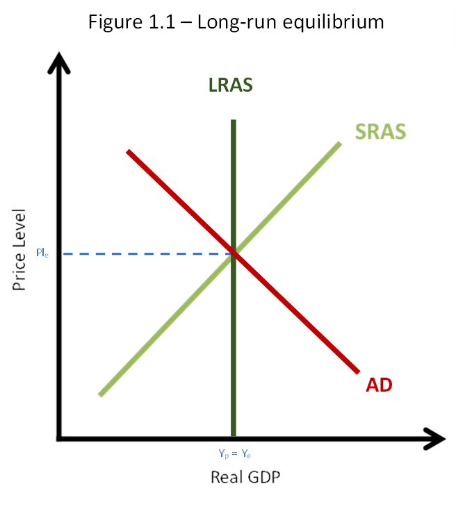
A dashed line is often used in economics diagrams to represent a predicted or hypothetical situation. This can be useful because it allows the audience to understand the assumptions and predictions of the model, and to consider the potential outcomes of different economic scenarios.
For instance, in Figure 1.1, a dashed line is used to illustrate the market equilibrium.
To change the style of a line:
- Select the line you wish to change the style of by clicking on it.
- Go to the “Format” menu at the top of the screen.
- Scroll down and select “Borders & Lines” -> “Line Dash”
- Choose the desired style of the line from the options that appear. The options include solid, dotted, and dashed lines.
Tip: you can also change the thickness of the line by clicking on “Line weight” in the format menu.
Step 6: Add the diagram to your report
Once you have finished creating your diagram, you will need to add it to your report. There are a variety of word processing software options available, but I personally suggest using either Microsoft Word or Google Docs due to their ease of use and compatibility.
Save the diagram
To save the diagram:
- Open your economics diagram in Google Drawings.
- Click on “File” in the top menu.
- Select “Download As” from the drop-down menu.
- Choose “PNG” as the desired file format.
- Click “Download” to save the file to your computer.
- Locate the downloaded file on your computer and open it to view the saved diagram.
Insert the diagram
To insert the diagram:
- Open your report in Microsoft Word or Google Docs.
- Position your cursor at the point in the report where you want to insert the diagram.
- Click on the “Insert” tab at the top of the screen.
- Select “Image” or “Diagram” from the options.
- Navigate to and select the diagram file from your computer using the file explorer.
- Click “Open” to insert the diagram into your report at the location of the cursor.
Tip: if you’re using Google Docs, you also have the option to insert a diagram directly from Google Drawings by going to “Insert” -> “Drawing” and selecting the diagram you want to insert.
Author Profile

- Luke Watson has a BSc (Hons) in international business and economics. He is currently working as an IBDP economics teacher at Shanghai United International School in China.
Latest entries
- March 10, 2023CourseHow the Fed Sets Interest Rates Post-Crisis
- February 5, 2023CourseHow to Calculate the Gini Coefficient Using the Lorenz Curve
- January 29, 2023CourseHow to Score Full Marks on the Economics IA
- January 29, 2023CourseHow to Effectively Structure Your Economics IA


Comments are closed